STATEMENT OF INTENT
My chosen theme for my GCSE Level Photography exam is 'Portraits'. To specify, I will be focusing on trying to copy certain photographers as well as adding my own creativity and imagination to my work. I have decided to do this theme because I think that it allows me to be mindful with my work and explore different camera techniques; also improving the skills I have already learnt and showing it through my portfolio. I will create a final gallery of images but also possibly create Movie Covers as if it were a shoot for a Cinema Film .To make my work the best it can be, I intend to carry out many different research methods of my theme 'Portraits'. I will research and replicate a few photographers work that I think matches the theme I am carrying out. For example, Yousuf Karsh; his work consists of a range of lighting colors and the use of Photoshop. His work includes black and white photography as well as using a shadows throughout all his works. In order to replicate the work of Yousuf Karsh, I will watch tutorial videos on YouTube so I am able to gain knowledge on how to Photoshop my work like Yousuf Karsh does. With the lighting/shadows effects, I will hopefully try and visit art galleries that contain monochrome filter pictures only so that my work can be influenced by this type of art style. I hope to use all forms of media to enhance my knowledge of different types of photography to find the best decision for me. I will make a Pinterest account so I can be inspired everyday on ways to improve and replicate the work from certain artists/photographers. I will also use Chrome in order to grasp the concept of different photographers so I am capable of using ideas from their portfolios. I will also use forms of old media such as magazines, books to increase my understanding of different ideas that I am able to reproduce whilst giving credit. I intend to capture a variation of images to include in my portfolio of my chosen topic of Portraits. I will take 30-35 photos per person inside the school environment and a public environment which will include a maximum of four models present. All of my photo shoots will be influenced by the artists that I have mentioned , but I will also put my own creativity on my photos so that they do not look completely identical to the artists that I am taking inspiration from. I will complete 2 or 3 photo shoots with a different style in which they will have a contrasting and appealing outcome that shows my whole work in photography. I hope to achieve this as well as broadening my realization of different techniques I can use to make my work the best it can be. I quite like the idea of doing a fashion shoot that shows the different seasons, this would fit in with magazine idea.
I would like to experiment with a wide range of techniques within my work. I have a manual DSLR Canon camera which I will take all of my photographs on, but I would also like to experiment with my own mobile phone camera to see the effects that I can create with it. I will also try to push myself to be more creative within Photoshop, learning how to use the image adjustment layer for Black & White, exposure, levels and contrast. I will also experiment with new techniques within photo shop I have 3 months to produce my Website of work towards the production of my final piece. I aim to complete my initial research within the 2 week and start photographing by the 3rd week in order to give me the time I need to show progression. I will then continue to develop my work in photoshop and be prepared to go out again with my camera and capture new images to enhance my project. When I have completed the project, I will select my best photography outcomes and display them in my final gallery to show how well I've done throughout this project so far
As my project progresses I will use annotations throughout my webpage labelling my ideas and development clearly. This will also help me to reflect and work on the work I produce. I will mainly seek advice from my Teachers on how to make my work better, as I’m always aiming to push myself to extraordinary levels. I will also watch demonstrations and find my own as well to help me develop my skills and knowledge of Photoshop. After the creation of my final portfolio I will write a final evaluation on the project as a whole, reflecting on what went well and what I would do differently or change given the time. A 3 month portrait project. In order to try to get my work as good as Alex webb. I will go to different places all around greater Manchester and I will take a series of photos for example the bridge at media city or the statues at trafford centre. I want my work to be experimental and resourceful. For the finest and excellent piece of work I will use photoshop for my editing and watch tutorial videos on YouTube so I am able to gain a lot more knowledge get a really high standard final gallery.
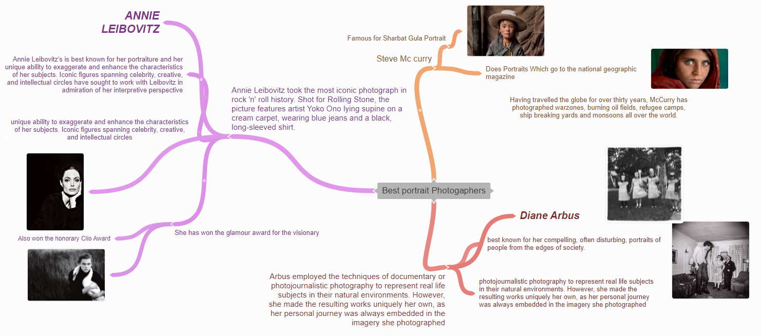
Research On Steve Mc Curry
Context
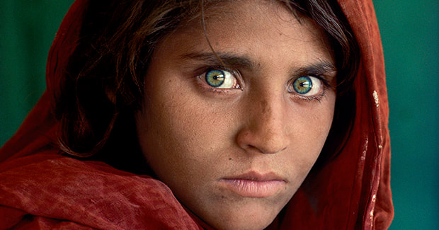
Steve McCurry (born 1950) is best known for his evocative color photographs that document both human struggles and joy. Having travelled the globe for over thirty years, McCurry has photographed warzones, burning oil fields, refugee camps, ship breaking yards and monsoons all over the world. He brought the world the first images of the conflict in Afghanistan, including his celebrated image of the Afghan Girl, Sharbat Gula, that has become one of the world's most iconic photographs. His work spans conflicts, vanishing cultures, ancient traditions and contemporary culture.
https://mastersof.photography/wp-content/uploads/2018/01/Steve-McCurry-Lesson-05.pdf
https://mastersof.photography/wp-content/uploads/2018/01/Steve-McCurry-Lesson-05.pdf
COMPOSITION
In this photograph by Steve McCurry I can see that he has used several techniques in his work including Rule of Thirds, Place points of interest on intersections and Leading Lines. He has placed the girl’s eyes on the ‘sweet spot’ in one third of the image which draws your eye to this focal point. Leading lines are created by her headscarf which frames her face to make it stand out.
The contrast of the red against the green background clashes and is a great technique for framing the face. I can also see the green in her eyes matches the background and so it brings harmony to the photograph. There is soft light coming from the right hand side that lights up her face and highlights the whites of her eyes, this brings life to the photograph, with the darker shadows helping to frame the shot.
In my opinion, I think this shot is taken outside but McCurry may have used a reflector to soften the light and to control where it fell. He may have used a 50mm lens and a shallow depth of field/Fstop as the background is blurry. This helps to not distract from the main focus and impact of the girl’s face.
CONNECTIONS
He intends to show what war does to not only the landscape, but to the people who inhabit that land. "Most of my images are grounded in people. I look for the unguarded moment, the essential soul peeking out, experience etched on a person's face. This inspires me to take photos of unique things like warzones showing how people suffer throughout. Its amazing how he has thought of such an idea it makes it so appealing to the eye. I would like to do the same using a canon camera to take photos of something that's related to Steve Mc curry photography. I will follow the theme of disturbing and compelling. I like the way how the frames have been shot and cut out for that sweet touch to the photos
COMMENT
I like Steve Mc Curry's work as its got a special meaning to it. It shows the world what people go through but through pictures and not videos. Broke homes scars and blood; It shows it all. A very good picture was taken by him in Pakistan of a girl with bright green eyes this was a very famous shot it showed the sadness in they girls eyes. You could see tears in her eyes showing it was an unfortunate event that had occured . I love how Mc Curry took risks to show the world what under developing country's are having to go through
Research on Annie Leibovitz

CONTEXT
Annie Leibovitz, original name Anna-Lou Leibovitz, (born October 2, 1949, Waterbury, Connecticut, U.S.), American photographer renowned for her dramatic, quirky, and iconic portraits of a great variety of celebrities. Her signature style is crisp and well lighted.
Works written: A Photographer's Life, 1990-2021
Professions: Photographer
Born: October 2, 1949, Waterbury
https://www.britannica.com/biography/Annie-Leibovitz#:~:text=Annie%20Leibovitz%2C%20original%20name%20Anna,is%20crisp%20and%20well%20lighted.
Works written: A Photographer's Life, 1990-2021
Professions: Photographer
Born: October 2, 1949, Waterbury
https://www.britannica.com/biography/Annie-Leibovitz#:~:text=Annie%20Leibovitz%2C%20original%20name%20Anna,is%20crisp%20and%20well%20lighted.
COMPOSITION
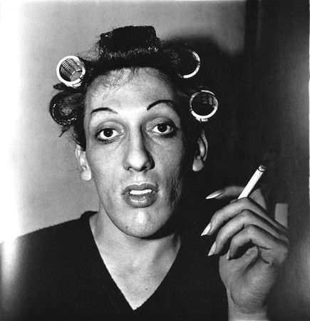
In this image by Annie Leibovitz I can see that she has used ambient lighting when taking this photograph. I can see that the face is lit up but forms a contrast with the black of the background hat and coat, which makes it very striking and stands out. To avoid camera shake she may have used a tripod, as I think this could have been a studio shot, she would have time to control the shot. I can see that she has used a simple background as she wants the main focus to be the face. The rule of thirds has been used as a compositional technique, the top hat in one third of the image. By using the sweet spot she attracts her audience to this focal point. In my opinion there is not a deep depth of field as the background is quite blurry and shallow. I believe she uses a low ISO of 200 as she doesn't take bright photos. It looks like she used a fast shutter speed as the image is not blurry. The camera angle has her models looking at eye level to the camera so we are drawn into the shot and focus on the sad eyes of the model. Her use of black and white adds a very dramatic effect, especially the darkness of the eyes.
The image is quite tightly cropped, the face being very close to the picture plane which adds impact and helps us to pick out the details of the texture of the face, the cigarette and hat.
The image is quite tightly cropped, the face being very close to the picture plane which adds impact and helps us to pick out the details of the texture of the face, the cigarette and hat.
CONNECTIONS
Annie intends to show what famous celebrities in her photography and even though her portraits make look basic there's a lot to them. This inspires me to take photos of unique things like famous people showing there feelings through portraits. A famous person she took portrait photo of was Angelina Jolie a famous actor. Her most famous portrait was takin in 1980 which became the most iconic picture. Its amazing how her thought of such an idea it makes it attractive to the eye. I would like to do the same using a DSLR camera to take portraits of something that's related to Annie's photography. I will follow the theme of Basic and appealing . I like the way how the frames have been shot and cut out for that sweet touch to the photos I love her theme of Black and white as its quite alluring and chill. I love the way the frames have been cropped so the you only see her models face and not there bodies. Its very impressive.
Comment
I like Annie's work because it does indeed show a lot in her portraits, She is quite inspiring and has a very unique ability to exaggerate and enhance her work. She is very creative and iconic. What's even more great is that she won the glamour award for visionary too. Overall a very good and basic portrait photographer who somehow makes basic photos look very eye catching. I cant wait to do photography related to her. Its a masterpiece but looks so basic. I just love the way she takes the portraits. She's very dramatic, quirky and iconic. With her vivid colour portraits and her style of the setting being staged and her superb lighting.
Diane Arbus
CONTEXT
Diane Arbus (1923–1971) is one of the most original and influential photographers of the twentieth century. She studied photography with Berenice Abbott, Alexey Brodovitch, and Lisette Model and had her first published photographs appear in Esquire in 1960.
Professions: Photographer
Forms: Photography, Photograph Diane Arbus was an American photographer. Arbus worked to normalize marginalized groups and highlight the importance of proper representation of all people
https://www.davidzwirner.com/artists/diane-arbus/biography#:~:text=Diane%20Arbus%20(1923%E2%80%931971),appear%20in%20Esquire%20in%201960.
COMPOSITION
The picture shows a clear bright tone across the left side of the image which highlights the models nose, hair curlers, cigarette and nails. The contrast of the bright white against the darker tones makes the image quite striking and it stands out. I can see that the Rule of Thirds is shown, as the top of the face is higher in the top half of the image whilst the rest of the face is placed at the bottom half. This makes the viewer look into the eyes of the model and connect with the image. The hand and cigarette are located around the sweet spot of the composition grid which makes the object very appealing to the eye and draws attention to this detail. In my opinion I think that the image has been taken using a fast shutter speed to capture the reality of the image and make it very clear to the eye. The image has been shot indoors so it was probably taken as a studio shot so that the photo can be very easily manipulated and controlled. Photoshop may have been used to fix up minor details such as black and white and using the healing device to get rid of the smoke.
CONNECTIONS
This image links with our portrait project because it involves taking a picture of a person's face and adding your own effects and edits to make it look unique. This automatically makes it more captivating for the audience which is why I like Diane's piece of work. It requires you to outstand an already perfect picture by using photoshop to make the picture more breath taking and majestic. This way whoever will be looking at the portraits the examiners. They will be grading our work to top marks. I used similar colours in my work in the sense that my pictures and this picture include more black and white and also the use of lighting for certain areas of the photo. Despite that I did also use lighter tone colours so my work could have a contrast of dark to light colours which would show the examiner a variety of different colours even if its only black and white however different shades but not too many to the point where it becomes distracting and confusing. I also did use similar photoshop by showing the face and the shoulders. I would use different ideas in mine which is what I did but instead using a different Diane Arbus Model Photo as a guide. In my opinion I really adore Diane work as it is something that I am into and intrigued by. I really like how she uses very dramatic, spooky features in her pieces of work such as dark colours colours and distinctive photoshop skills to inarguable and personality and introduce into her work.
COMMENT
I personally don't mind Diane Arbus's work however I would prefer not to use it to often as i go for a more interesting and modern look in my photos and Diane Arbus did quite old photos even before her era. She does make quite disturbing portraits but this does compel her audience. I like how she shows people from sides of society. Overall her work does inspire me for maybe future if I ever want to make them types of photos.
COGGLE MIND MAP
MOODBOARD
Black and white Portraits


Warzone/ Refugees


Colour/Creative


My Shoot Plan
I am starting my project by taking inspiration by Annie Leibovitz who is known for including photoshop to make her images appear unique. I really admire how her work is portrayed as basic but attractive to her audience in order to keep her audience inspired and interested. I am going to add this into my work by using close up shots of the face from the head to the neck, then experiment with photoshop, and maybe add different colors such as black and white or two toned editing to enhance my series of image's. The equipment I will be using is a Canon DSLR camera which may will be put onto a tripod so I can get a series of images in the same exact location. I will not use a fast shutter speed this is so I can capture the model's features better. I will use a background of grey using so the background will be smooth and easier to edit over in photoshop. I may need a studio light so the light can shine onto the models face so they are toned up and that they can show how two tone works.
The camera setting will be changed throughout so it can fit with the theme of the image taken which will be black and white. The white balance may be on 100 depending on the location of the photo which is indoors . I may use a reflector to display a warmer side tone on my friends face. I will also use photoshop so I am able to achieve the final products. I will organize my shoot in school as my friends are in my photography class. My background will need to be grey for my darker colour theme. I will tell my friends to wear dark clothes and there going to need to be plain.
The camera setting will be changed throughout so it can fit with the theme of the image taken which will be black and white. The white balance may be on 100 depending on the location of the photo which is indoors . I may use a reflector to display a warmer side tone on my friends face. I will also use photoshop so I am able to achieve the final products. I will organize my shoot in school as my friends are in my photography class. My background will need to be grey for my darker colour theme. I will tell my friends to wear dark clothes and there going to need to be plain.
Media City (Salford trip)
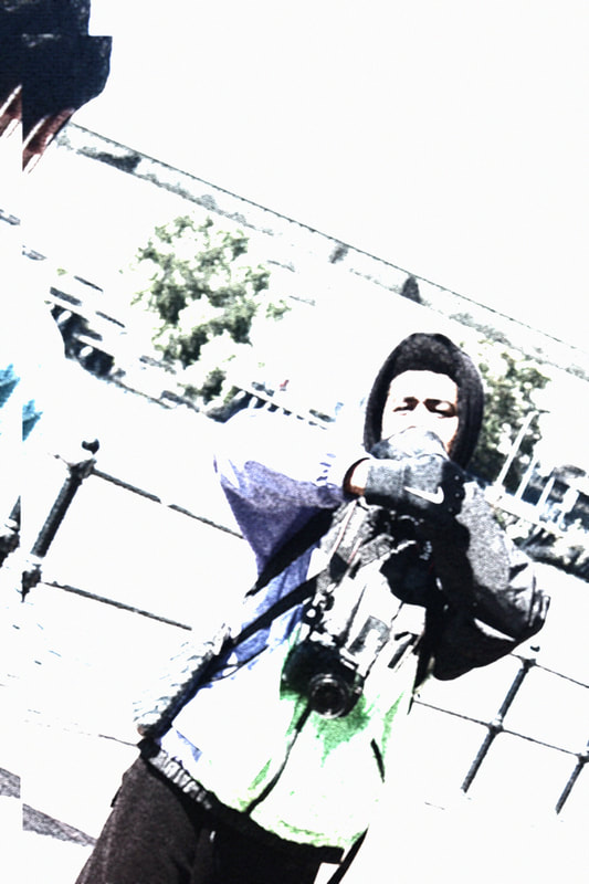
Joshua Douglas


This is my best because it shows the shadows clear and the angle of the image is perfect. Also the lighting is really good, you can see the sun reflecting off his face
|

This portrait is my word because the model can be seen staring downwards and one of his hands are on the floor. This results in the shadow changing and the outcome not being the greatest.
|


This is my best one because the lighting and contrast on this image is really good. I told the model to put his camera up so it looks like he is taking a picture
|

This is my worst because Joshua isn't focused. Also he has covered his face which wasn't needed for this particular portrait .Lastly the background isn't good at all
|


I think this is my best photo as i have given my friend a realistic pose to make and you cant see and blur. Also you can see the amazing background
|

This is my worst image as i have given Josh(friend) a made pose we cant see his full face. Also we can see some blur in the top left corner in the building which ruins the photo.
|


This is my best photo as Josh has a natural pose here. The background is amazing. We can see the lake and also the bridge.
|

This is my worst photo because the photo isn't straight and he was pulling his jacket up from near the hand. This ruined the picture also the bridge was being blocked and we could barley see it.
|


This is my worst photo as its very dark and the ISO wasnt set. This was my fault as i didnt change the dot to the centre.
|

This is also my worst photo i have taken as its too dark and your cant even see josh
|


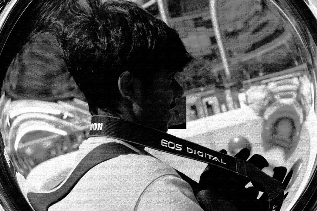
This is my best photo as Josh is taking a good pose the ISO was good and we could see his reflection in the mirror of the building behind him.
|
This is my worst photo as his face has been blurred and he is on his side and not straight.
|


This is my best photo as the ISO is set good. The white balance is on daylight and Josh has a good stance. No blur
|

This is my worst as there's no meaning to this photo
|


This is my best photo as Josh is rolling his hands and I've taken the photo at the right time so that theres no blur we can also see the water.
|

This is my worst has his face is being covered and the picture isn't straight. Also there are people in the background.
|
Patel


This is my best photo as Patel can be seen sitting on a stone and I have taken a natural photo
|

This is my worst photo as we cant see his face and we can see huis camera when we are not supposed to.
|
PhotoShop


My Work With Justin
My Shoot Plan!!
I'm Starting this project to show contrast between colours and how reflection of light can be used. The equipment I will be using is a Canon DSLR camera which will be on a tripod so I can get a series of images in the same exact location as this will be a Still Shoot. I will use a fast shutter speed so I can capture my mates features better and get a good glimpse of the light. I will use a background of red and green using an infinity curve so the background will be smooth, clean look and easier to photoshop over. I will need a studio light so the light can shine onto the models face so they are visible and so I can get a good reflection and show contrast for the photoshoot. The camera setting will be changed so often so it can fit with the theme of the image taken. The white balance will be auto depending on the location of the photo. I will use a white reflector to display a nice moon undertone on the model's face. I will also use photoshop so I am able to achieve the final product to a high quality standard. I need to make sure my camera is fully functional and charged and that I delete photos after uploading them so more space is available on my camera.
My models are going to be my friends, Joshua Douglas And Maya Douglas I will tell them to bring bright, colorful clothes and dark, dull clothes to fit with my two themes. I will also tell them to bring accessories like glasses, scarves and bags so they can act as props for my images. They may also need to wear type of makeup if they want to enhance their features so they look more appealing. I will organize my shoot for the term holidays. My background will need to be red/green for my darker contrast colour theme theme
I am aiming to capture approximately 30-35 photos per person using the two background colours and to experiment with different lighting techniques so I can get different angle shadows and facial expressions so I can find the right outcome that will fit for my weebly.


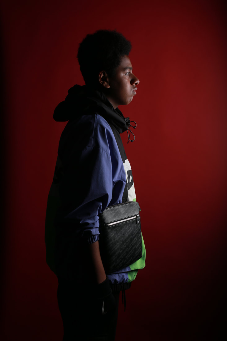
This is my best photo because its we can clearly see a clean reflection off the red wallpaper of the studio light that I used. My model is posed correctly and there is no blur in the photo. We can also see a nice reflection of the light on my friends man bag this makes it stand out and also the bright color green on the coat
|
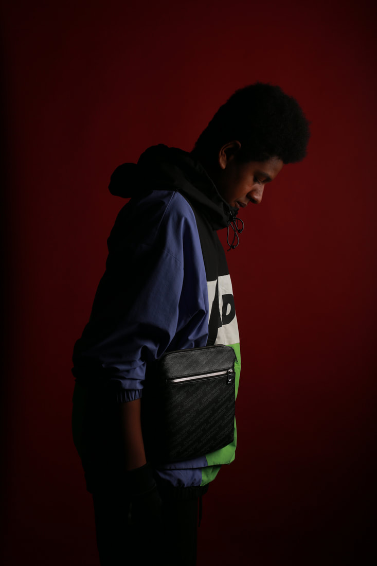
This is my worst photo because it has my friend facing downwards which does ruin the shot here as this is supposed to be a straight face side look photo. The reflection of the studio light has gone behind him and was supposed to stay at the front. This is my this is my worst photo.
|


This is my best picture in this gallery because we can clearly see the phone he is holding and a very natural pic is being given out. There is a bit of light reflecting off his sunglasses and we can
|

This is my worst picture because as you can see my friend isn't in a good angle for the camera and also he isn't looking into the camera. This could of been a nice natural photo however this is some shake towards the face
|


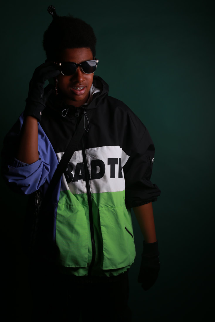
This is my best photo because he is looking straight at the camera and also the light is shining at his face. This gives a bright look. There is shadow on the left and light on the right
|

This is my worst photo because my friend is covering his face and this is a portrait photoshoot. We can also see that the light is reflecting of his arm instead
|


This is my best photo because there is a shadow and the light is reflecting off his face. This goes with my plan of how shadow and reflection of light works
|

This is my worst photo because his head is facing up and we are trying to see the whole face. Also the reflection of light and shadow is on his neck and we want it on the face
|
ADVANCED PHOTOSHOOT
The reason I have used this tutorial for my first advance photoshoot is because he teaches you very clearly and also helps with how each edit works on photoshop. I made the photos in under 15 minutes using this video. I'm really happy with this video because it has made me understand how to make amazing high quality photos with not a lot of photoshop skill. He showed step by step on how to make the photoshop edit give me high grades. Also he showed how to make personal gradients and this helped out so that when I get to make more outcomes then I know how to make the background gradients


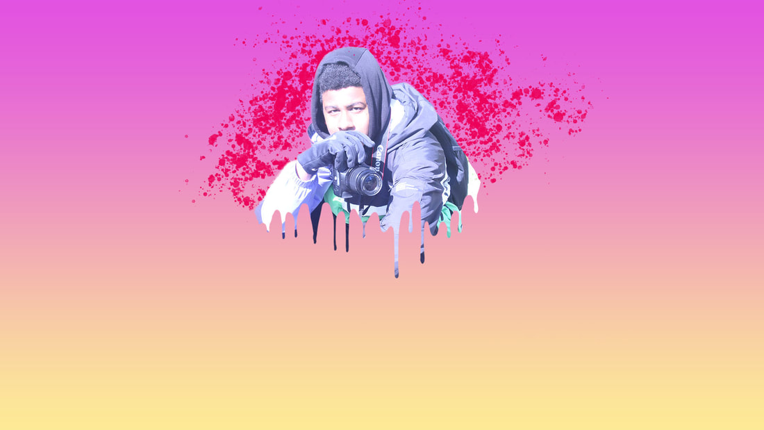
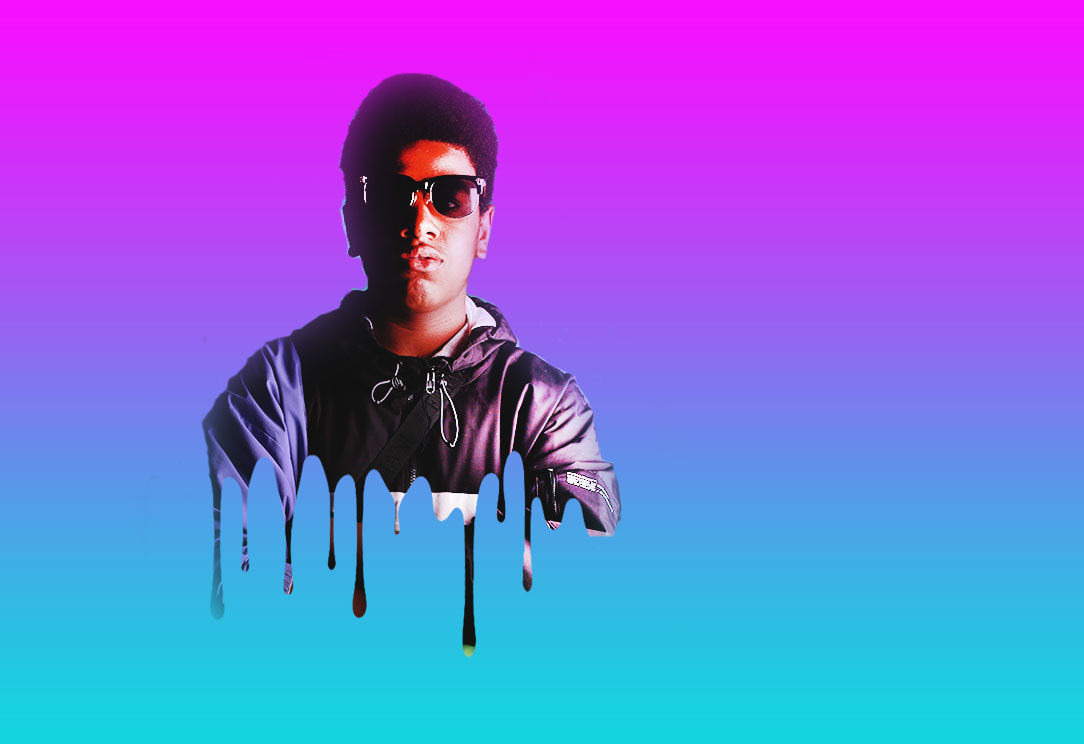
I'm really impressed with my work here because using the tutorial I have added a nice drip effect on my model (Joshua) and also a splatter effect. The gradient I used was a pink to light soft yellow and this creates an ambient atmosphere as his jacket also has a touch of purple. Also I added light towards his face so that it can stand out. I could of done a lot better though with smoothing out his outline with the background gradient using smart radius and feather edit. This would of made in merge and give a more 1 whole photo effect rather then a 2 back and out line photo. I'm could of also made the gradient radial which would of made a circular glow in the middle of the photo. This would of made Joshua's Photo eye appealing and would of also made the quality better


I am mind blown with what I can do with photoshop 2021. Here we can see a very aesthetic photo of Joshua and made sure I did better then last time. I added radial gradient. A pink to purple background. I'm experimented without any help with adding shadow to his face. It turned out very well and impressive. I also decided to make the drip effect longer. To do this I enlarged it and also made sure to make it fit so it doesn't ruin the face and stays under the neck. The reason I went for this type of photoshop was because I wanted to show how A simple photo can be changed into a masterpiece and also how editing with Photoshop isn't as hard as it may be seen. To be honest I made quite a few mistakes in this photoshop to for example making the shade to dark and the brightness too bright. It wasn't balanced enough and has shown a negative effect to the photo. Problems I encountered was while making the Photo edit was the drip effect not showing and even the smart radius not working. This was fixed by removing the photo as a layer copy making it the background and then changing that to the layer.


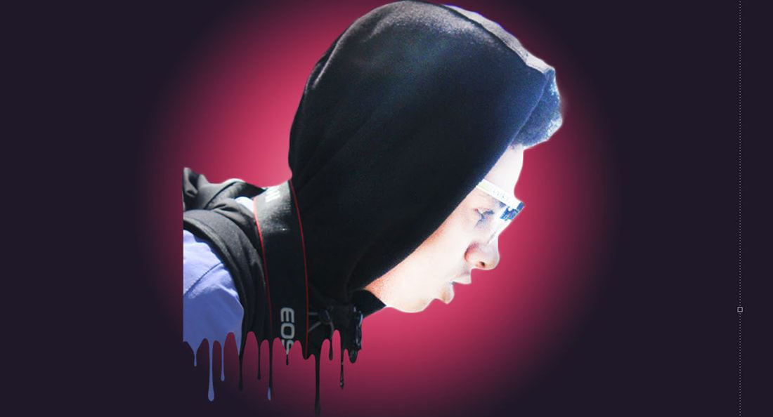
I've made a lot of effort in this photo because it was really quick to make and and made my photo stand out a lot. I decided to use a variety of effects in this photo which include face glow, drip effect and also outer glow. I made sure to tilt Joshua's photo as this way its quite unique and very different to other photos that I have seen. Throughout my photos of making drip effects we can see I have been making massive improvements with refining edges and smoothing parts out. Also my drip effect angle positions have been getting better
(For The Photo Above). As you can see the reason I have used this video tutorial for my shoot is because It was very easy to learn this glow effect and has made an improvement to m photos. It gave clear instructions and it was the 2021 photoshop so this actually helped a lot. It was just under 10 minutes this made it efficient. I really look forward to re-watching this video and making more glow effect photos with other effect for example drip or double face.


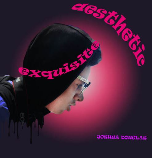
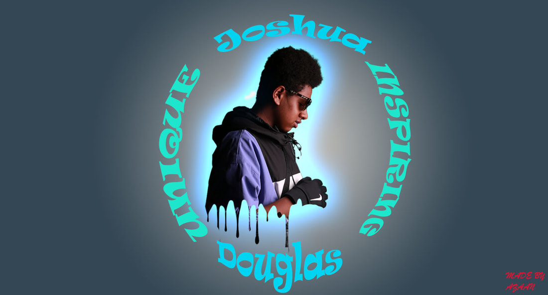
By far my best photoshop. I am really happy with my outcome. I added Joshua's face towards the side for a pop out effect and this is very appealing. I also added very interesting words like aesthetic which show us things like the colour of how purple it is and the appreciation of beauty which ha been presented here. I used glow drip, towards the neck, face toning, brightness and contrast and also radial gradient.
COMPARISON BETWEEN MY EDIT AND THEN REFINING

|
|
As you can see I have made a lot of improvements to my photoshop. My refinement Photoshop looks like a poster which is how I wanted my photo edit to be like. I decided to make the background a lot more smaller so there wasn't a lot of space and also i decided to add my models name with a few words. The face was very bleached so I decided to use my contrast and brightness to turn the face toning down. This made the face more clear and also It made It stand out. I went for an all purple pinkish theme as I wanted an aesthetic vibe to my Poster. This would attract people to dive more in to see what's more to the photo and if there's more then 1. By far my best photo and also It has had the best improvements. Finally I've made the face smaller and moved it to the left so i could add the text and also removed all the space which was behind the photo so it didn't look plain


I have made a lot of effort in this photo. I carried on my consistency with adding drip to my photoshops however I decided to add text and upper and lower arc effect to them for a more convincing look to my photo. I thought of radial gradient however with some thought i decided to annotate and remove the radial so I could add a glow to my photoshop. This has really made the photo a more towards a high standard.
EBI= I need to do some good editing with the background now as its really plain and does make the photo not look as good as it should. Maybe adding a live background for example something like graffiti for a unique look would make the photo better or glow to the text and make the font differnt or even maybe change the drip effect to water droplets. Several improvements can be made towards my Next and final photoshop.
EBI= I need to do some good editing with the background now as its really plain and does make the photo not look as good as it should. Maybe adding a live background for example something like graffiti for a unique look would make the photo better or glow to the text and make the font differnt or even maybe change the drip effect to water droplets. Several improvements can be made towards my Next and final photoshop.


Final Gallery


|


|

|

|
Evaluation
My Evaluation, So far I have made a lot of effort with my photoshops. I have used different types of photoshop techniques for example the main one which I have been using throughout the drip effect. The drip effect consists of a look of when you paint and it drips. It gives a very cool effect and looks really good on my model. The next thing I used was the glow effect and this gave an aesthetic effect to my photos. I added radial gradients throughout all my shoots and this helped a lot. Towards my final 2 I decided to try out using a font text to personalize me and also to improve my photos and make them look amazing. My work went successfully and I developed some really good highly made photos. However I definitely need to consider changing up my backgrounds now for my final galleries and maybe add a 3d effect for me to get the grade I want.
I need to make sure I do amazing refinements to my work. The ideas I am thinking off for the final gallery are posters for a movie. I can add some proper edits for this. Double contrast drip and a background can result in a really good ending. To make sure that my photos are personal to me I will decide to add my favorite colors and also words which can describe me. I will be sticking to a movie theme for all my photos. I am expected to make a minimum of 8-10 photos which link to my idea of a movie poster. This will take a minimum of until Christmas to finish. I will be taking pictures of Zidane and the reason for this is because the titles I'm thinking of for my posters need to involve a person with good facial expressions which my model (Zidane) will have. I will take around 12 photos and find the best ones to edit. I need to make sure that they are clear and the quality of the photo is good. The final outcome will be of the 8 photos and also an evaluation to show how I started to the incredible improvements that will be made.
I have done multiple photoshoot workshops so that I have skill in photography. I really learned new techniques throughout my journey. I had a few problems at the start getting used to photoshop as I have never used it but gradually got better with it. The photographers I focused on were Annie Leibovitz, STEVE McCurry and Diane Arbus. They really impressed me with there work and I wanted to do the same. I really enjoyed learning about how to take the best portraits and how to use computer editing for example photoshop. This is a life skill so now I can take good photos and edit them. Finally I felt most successful with my Photoshop edits as they turned out to be unique and impressive. They are to a high quality too with all the different edits on it for example drip, glow, font text etc.. Overall I have done really good but there is room for improvement.
EVALUATION
My main theme was quite different to what I was currently doing. I went as Mental health I want to show through my pictures how people feel when going through either depression or mood disorders even anxiety. Through the photos I make via Photoshop I want to show the world who suffer from Mental Health that its okay and you should talk to someone about it. I will be producing 10 Final Outcomes which will end my portrait project. They will be to the best quality and given a lot of good edits. Also they will have a meaning behind them for each photo.
In photography I found the use of Photoshop the most interesting because I enjoyed manipulating my work and improving the images I had taken. I really enjoyed doing the projects by going different places for a new look each time. The main one was Salford trip we went to the media city and saw a lot of buildings for texture and also places for portraits where it would look good. Learning to use the camera wasn't hard but I did learn a lot of things about it for example how f-stop works and shutter speed. I found out how to change the ISO and what each setting on a DSR camera means. Editing my photos was tricky but enjoyable as I had to watch a dozen tutorials but it was worth the watch as I get some very high standard photo results.
On photoshop I learnt a variety of techniques including how to add glow to a photo or how to blur certain parts of a photo. The best thing I learnt was merging 2 photos for an amazing outcome. I decided to use the drip effect and also color correction. I went on YouTube for my videos on how to use hotkeys on photoshop and that helped me to work a lot quicker and efficient. I would love to develop my skills in photoshop as I believe I can do way better and make more outstanding outcomes which will look appealing. I really want to learn more on the gradient tool as it can change the whole theme.
The 3 photographers that I researched and was stunned by was Annie Leibovitz, Diane Arbus and Steve Mc Curry. They would show a very strong meaning through there photos. For example for Steve there was pain and heartbroken and war or for Diane there was depression. They really inspired me to do the same and show meaning behind photos. So I added text to show what I am made of and how I feel. I made sure to personalize it to me so instead of making the photos black and white I made them In color and that really made my photos stand out once they were edited in Photoshop. For my photoshop to be successful I used Photopea first which was an easier version on the browser for Photoshop. The tools were more easier to handle and use but it was a glitchy website. However it gave me insight on Photoshop and helped me learn quicker. In my opinion it was a very good way of learning how to edit photos and you can change the whole way you see the photo. It made me grow confidence and and that could edit photos and make them at a good standard.
My most successful part was making my Weebly website as gradually I have improved on how it looks and if it went public how others would get appealed by it. It really gave a professional looking portfolio of my work. My final outcome turned out to be really good. I did have some problems at the start deciding what it should be theme based on however once I knew what the mood would be I made 6 outcomes. The technique I used the most was copy n paste drip effect. It really made my work look aesthetic and very creative.
Covid lockdown really effected my work in a bad way as I didn't attend any lessons and I missed out on learning. I couldn't learn anything on Photoshop as that was in school. It also stopped me from going to varies locations for a photoshoot. When school restarted I made sure to be focused and even because we couldn't go to locations. I started to work more on improving my website and also improving my skills in Photoshop. For the in school projects using lighting was hard at the start but I eventually improved and it made it easier. Overall for my final outcomes I made sure to watch a lot of tutorials and .I learnt how to use a camera on manual and how to edit them on Photoshop/photopea. It was a very hard to get a grip at Photoshop and I'm still not perfect but my skills in this are getting better. My journey on portraits has been outstanding throughout. I made sure to stay focused and get my work done.
I could improve on my time management though for Photoshop as I believe I spend too much trying to think what to make. Also for future projects I need to make sure to bring props and this will make the photos look more professional. If we do go into a lockdown I will make sure to attend all my lessons and get the work done. I will try not to talk to my peers when its independent learning and finally try to get in more of my own shoots outside of school and edit them
